See, I LOVE pattern-filled, colorful rooms, and while all those neutrals were playing well together, they were not playing well with ME, and it was bumming me out.
Of course, I was expecting my yellow door painting project to bring in that punch of excitement, but I knew that it would be the shower curtain that would set the tone for the room. The problem was, despite the gazillion options out there, we just couldn’t find one that was the right pattern and the right price.
We loved punchy, graphic look of the Octopus Garden Shower Curtain by Anthropologie, but just couldn’t justify dropping $149 for a shower curtain. I also wasn’t sure if adding a charcoal and white graphic in my charcoal and white bathroom was the right call. Too matchy-matchy?
I wanted something interesting, and filled with bright colors and patterns. We almost bought 3rd Period Science by Robin Faye Gates through Deny Designs. Now that’s a shower curtain. It was certainly interesting and would have been a big presence in the room! I actually still kind of love it. But we still didn’t think $89 was reasonable, and it seemed a little… out there… or a lot out there to have looming so large in a small space.
We actually lived with just a shower curtain liner for a long time because we couldn’t decide. Meanwhile, everyone was telling us to just buy one already. It’s just a shower curtain, what could possibly be the big deal?
Um…. did you not hear me say that this would set the tone for the room? This is about a big of a deal as it gets. (That’s my sarcasm voice.)
However, at the same time that I was lamenting that I didn’t like any of the shower curtain patterns out there, I was also lamenting that there was nowhere in the house to install some cool mismatched tiles. I just love that look.

Image from Decoratrix
Finally it I put those two ideas together. After a quick search to see if there was already a tiled shower curtain out there with the look I wanted (there wasn’t) I decided to design my own.
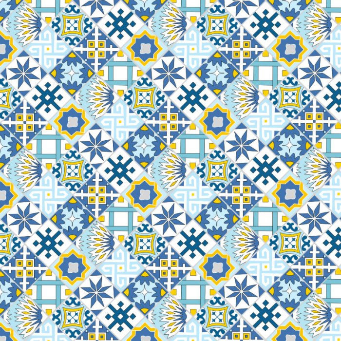
To start, I designed nine tiles that I liked using a free version of a graphic design software (Serif Draw Plus Starter Edition). I experimented with color palettes and eventually decided on just blue, gray, and yellow, since it would be busy to have a ton of different patterns AND colors going on in one place. That would work in a spartan or expensive looking room, but I didn’t think my space could handle the pressure.
I based a few on tiles I loved from images on Pinterest and designed a few myself from scratch. I edged each tile with a light gray color to simulate the presence of grout.
Then I tried different combinations. I liked the look of alternating individual tiles (like my inspiration image), but the Advisory Council (a.k.a Brad) thought it was too busy.
It worked better to alternate them in groups of four, which had the bonus of showing some of the patterns created by the tiles when they’re next to their own kind.
Once I knew that was what I wanted overall, I made a few final adjustments. I muted the colors and changed up the coloring of some of the tiles, because I thought it was still too busy. I also made them all a little smaller so they would be close to the size of real tiles once the image was printed on the 69″ x 70″ curtain. It was late at night and I was tired, so instead of doing math I just took my best guess by squinting at our existing shower curtain liner and imagining that it was made out of tiles.
It took a few tries to upload the huge file to Café Press, but once it was up it was easy to align the image and order it. With the sale code they were running at the time, it only cost about $50 plus shipping. Not the cheapest shower curtain in the world, but much less than the other options we’d been considering!
My main worry was that it would be all pixilated once it printed so large. It took forever to arrive, and by the time it did I was convinced it would be horrible and that the image quality would be terrible.
I was pleasantly surprised! The curtain quality is pretty good and the image printed really well, not pixilated at all. And, as luck would have it, the yellow and light blue are almost the same as the paint colors we chose for our interior doors and living/dining room walls. Usually I don’t want things to coordinate so tightly, but this is a small enough detail that it works for me.
Here it is hanging in its rightful place:
I love that it adds some pattern and fun to what is a pretty sterile space. It is bright in person, so I’m really glad that I decided to dull the colors and cut down on the yellow at the last minute. The grays and blues play well with the charcoal walls (which have a blue undertone).
The fun shower curtain and bright doors have really brought this room more in line with the rest of my house in terms of color and pattern. And it (obviously) feels so much more finished!
This project totally won me over on Cafe Press. I always thought they seemed a bit gimmicky but the whole process was easy. It let me totally customize a shower curtain, rather than drive myself crazy trying to find the perfect one already in existence. I’ve since used them for other projects, including a gift for my Dad’s 60th birthday (which was super fun, and I hope to share soon).
Thanks for reading!
(Sharing at Think and Make Thursdays, AKA Design, DIY Showoff, Tip Me Tuesday, Sarah Celebrates, A Bowl Full of Lemons, Whimsy Wednesday, and I Heart Naptime – and FEATURED at Designer Trapped in a Lawyers Body and Shelterness)


