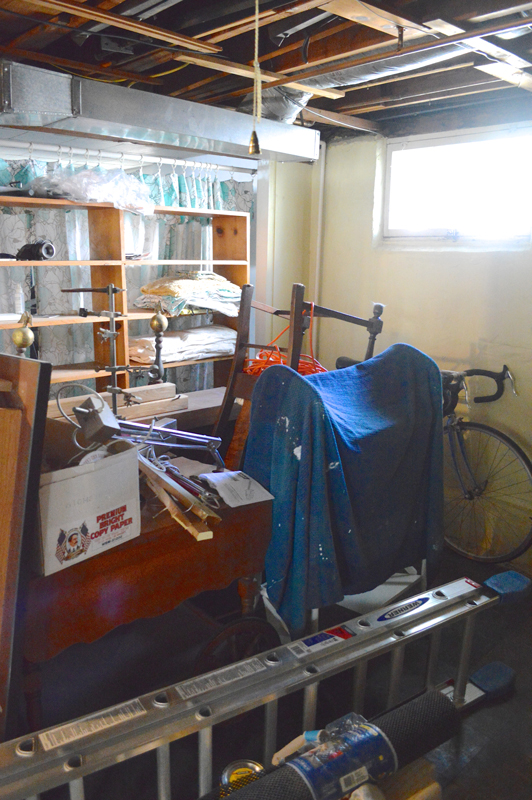
First, let’s remind ourselves how it looked when we first toured the house:
It’s gone through a few phases since we moved in. First we just put in the big IKEA bookshelf and desk that worked so well in our apartment, plus an IKEA dresser for office supply storage.
I left Sam in charge of decorating it, and turned my attention to other projects for our first year in the house. After a few months he decided that it felt too bleak, so he undertook a process to convert it from a study to what he called his “solarium” (no stereotypical “man cave” for my husband). This mostly involved setting up a hammock and filling it with plants, plus putting up some posters I gave him.
But while the room is plenty bright, it doesn’t get enough good light for plants to fully thrive…so it quickly became a room full of half-dead plants. Plus the room gets kinda cold during the winter, so it definitely didn’t have the warm tropical feel he was going for.
Added to that, the layout isn’t working so well for us. Sam doesn’t use this space a huge amount, so having the whole floor space taken up by a desk feels a little silly. Why dedicate a whole room to being an office if it isn’t frequently used? We’d prefer to have everything up against the walls, and that would leave the floor open for us to inflate an air bed and use as an extra guest room when needed (I know we already have two guest rooms, but Maddie lives in one of them and often when we’re hosting family we have large groups and could use a few different rooms). (Note: we did consider turning it into some other use entirely, but right now we’re blessed with a lot of space so there wasn’t anything more pressing we felt like we could be using it for at the current moment.)
This is when I finally inserted myself. I’d tried to be hands off and leave the decorating of this room to Sam, but with my desperation for blog content the space just not doing what we needed, I offered up my design expertise and Sam graciously accepted.
For the redesign, I started with the premise that we needed to get all the furniture onto the four walls. We also needed some better storage, since the IKEA dresser housing our office supplies is — characteristically — falling apart after less than a year.

I don’t mean to be picky, but it would be nice if all the drawers — or any of the drawers — would close all the way.
I also bothered to ask Sam what he wanted from the space in terms of functionality, and he said “shelves.” I asked him for some more detail about what he wants to put on the shelves (to determine things like spacing and depth), and he elaborated very helpfully: “just shelves.” So I guess we’ll be putting shelves in here.
Lastly, I decided I would let him pick the color of the room, because he does let me do whatever I want in all the other rooms of the house I thought this would make it more likely that he would help me with the painting. I thought something dark and moody could be fun, and tried to convince him with some photos like the below:

Sources: Apartment Therapy: Bryan and Sarah’s Vintage Modern Home and Studio| Apartment Therapy: Jessica’s Mostly Neutrals
But he insisted that given its small size, he thought lighter would be better. Maybe he’s right, maybe he’s wrong…I mean I do love our dark bedroom and bathroom, and neither of them are exactly spacious. On the other hand, I was totally won over by plain white walls in our guest room and gym transformations, so I’m going with the flow on this one.
SO! Armed with his very detailed specifications (“shelves…just shelves” and “white walls”), I moved to the next phase of my highly refined design process: spend weeks on pinterest looking for ideas. I usually create a project board and then pin things to it that jump out at me without thinking too much. Then I go back in and look at all the images next to each other and see if there are common themes about what I was drawn to. Here’s some of what I found myself pinning:

Sources: Side: Marie-Laure Helmkampf via Seventy Nine Ideas | Top: Lovely Life via Style Serendipity | Stylist Anna Mard via Annixen |Residence Magazine | Bottom: The Marion House Book via Apartment Therapy | PNN via Behance | Lucky via Apartment Therapy
Obviously shelves and white walls dominate, that was the starting filter so we have to go to a deeper level with the analysis. Beyond that, I was seeing long desks and sleek long shelves crammed with books. That’s good news, because we have plenty of books!
Based on that, I started to dig a little deeper on ideas for long desks. That are a lot of cool built-in DIYs out there. But I really don’t want to do something that feels more “permanent” or customized in the space, since I honestly don’t know how long this room will remain a study. Our whole use of the bedrooms will probably change if we ever build a second bathroom and move our master upstairs and if we find ourselves with additional humans living here. So I like the idea of a) not spending very much money to outfit this space given that it may be short-lived, and b) not doing anything that isn’t pretty portable or at least is easily reversible.
In the small space, I also felt like the fewer individual pieces of furniture the better, so the more streamlined look of desk + shelving in the Marie-Laure Helmkampf design above really appealed to me:

Source: Marie-Laure Helmkampf via Seventy Nine Ideas
So that’s where we are now: a wall dedicated to a desk and shelving unit as the main fixture in the room. That seems like a lot of brainstorming work to get to that relatively simple place, but oh well. And before you go saying “but you’ll have to drill a million holes in your wall to mount this!”, I’ve done some research and there are some wall-mounted shelving systems that just require mounting a horizontal rail into the studs at the top of the wall and then everything else hangs from that — so I think we can do something with pretty minimal wall damage.
In terms of storage, I think a lot can live on the shelves and the long desk. But we can also push my little filing cabinet under the desk, and I have a turquoise dresser sitting pretty much unused in the craft room that would provide a lot of storage and a burst of color. Here it is in our apartment — it was one of my favorite early DIY projects:
I also would love to find a way to work in the library cart:
Despite being styled all pretty for its debut on the blog, since then it’s been siting in the basement waiting to be brought back into the spotlight.
And of course, Sam wants to find a way to incorporate the hammock, which is a challenge given that it needs to span an entire wall and be mounted on the two walls adjacent to the wall it spans. But I think we can make it work. It’s his space, after all.
Anything else we should be thinking about as we finalize a plan for the space? We’ll be breaking out the paintbrushes any day now!

Sources: Top: Residence Magazine | Marie-Laure Helmkampf via Seventy Nine Ideas | Middle: Lucky via Apartment Therapy | Lovely Life via Style Serendipity | Bottom: PNN via Behance | Stylist Anna Mard via Annixen


